Limit Brute-Force Attacks on Self-Hosted WordPress
A while ago, I had gone and downloaded the plugin Limit Login Attempts on the advice of a blog post which I have since lost. The idea is that WordPress allowing unlimited login attempts make it easy (relatively easy) to get into your WordPress installation by brute force.
Not that anyone would want to get into such a small blog, but oh well! It’s a tiny plugin, and affects admin only, so no harm in just putting it in. Install and forget, basically.
Fast forward to now. After a long while of ignoring my blog, I come back and made a new theme, started blogging again, the works. Doing my bit of housekeeping, I was reassessing the plugins on my blog (not a lot) and checked the Limit Login Attempts plugin admin page out.
4,378 lockouts since last reset
Huhwhat?!
Granted, it’s probably not a lot compared to much bigger, more well-known blogs. But it’s definitely way more than I would have expected in my neck of the woods. I put the plugin sometime within the last two years, so that’s almost 6 lockouts everyday on average (more if the plugin is only over a year old).
I can’t imagine just how many times their brute force scripts would have hit my server were it not for lockouts. A lot of times they hit not only the 30-minute lockout, but also the 24-hour lockout period (3 lockouts, and you hit the 24-hour period lockout).
My own settings for my site are only slightly different from what comes out of the box:

The base settings allow 3 lockouts before increasing the lockout time, but I lowered it down to 2; I actually wanted to push it all the way down to 1. I use a password manager, I’m always on my own machine, and so it’s not very likely that I would need more than three tries to get my password correct. But, well, just in case. Go ahead and push it down to 1 if you’re brave, that’s six less attempts they can try. Less bandwidth spent for you ;)
I should also note that when they hit the 30-minute lockout with one login ID, about half the time they would try using a different login ID. Rinse and repeat. Scrolling down the list of lockouts, I see a bunch of attempts trying to login as the following:
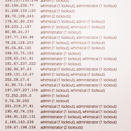
- admin
- administrator
- support
- whimsical
- adm
- login
- root
All this tells me two things:
- Don’t assume that you’re not a target. I’m small fish but I’m getting regular attempts; chances are, you are too. You just don’t know it. Get the plugin.
- Don’t use any of the above login IDs for your self-hosted WordPress login. Don’t use your domain name as the login. (Don’t use your name, either.)
Stay safe.